| Zeitschrift Umělec 1999/1 >> Jim Hodge’s Hardened Beauty | Übersicht aller Ausgaben | ||||||||||||
|
|||||||||||||
Jim Hodge’s Hardened BeautyZeitschrift Umělec 1999/101.01.1999 Tim Gilman-Ševčík | rezension | en cs |
|||||||||||||
|
When Las Vegas-based art critic Dave Hickey made his prescient and oft-quoted remark in the early nineties that the art of the decade would be about beauty, he was calling forth a resurgence of past values that had been neglected in the sixties, seventies and eighties, rather than signaling a move away from the conceptual learning that the art world has done in the preceding three decades. Beauty was never meant to be read as merely aesthetic, though aesthetics are an important element in the makeup, beauty cannot abandon the backbone of individual expression, be it political or social statements, or feeling and emotion, the symphony of personal revelation which stabs you when you see it.
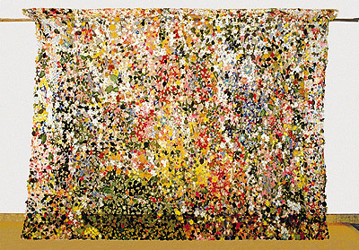
The beautiful work of New York artist Jim Hodges rises out of the garbage pile of American plastic production, of simulacra for beauty, in his stunning work with cloth flowers. The curtains and arches of dissected and bright blossoms appeal aesthetically, but do not finish with hollow meaninglessness. Like many of the artists such as Jennifer Pastor, Gabriel Orozco, Felix Gonzalez-Torres, and Catherine Spence in the “Nine for the Nineties“ show at the San Francisco MoMA, the aesthetic quality of Hodges’ work invites the viewer into the intimate space of work which confuses emotional, social and political content in an individual outlook. The individualism of the language may render the meanings difficult to identify concretely, but the presence of substance is deeply felt. If it were lacking, if aesthetics were alone proffered, wouldn’t the work be like a poor pop single that never makes it far up the charts, ruled by its own trendiness and hunger for fame, burn itself out quickly like a short match? The recent work of Jim Hodges at CRG in SoHo hints at a change in tack, his interests in beauty are enveloped in a struggle to understand how high-tech virtuality affects the way we see and think by building no-tech constructions. Without abandoning the insignificant and common materials he has relied on he has widened his reach to sink his hand into the glossy surface of computer-generated images, to see if he can’t pull something solid back out. He’s dumbed-down the ingredients, substituting cellophane for silicon and mirror chips for microchips, but the two most stunning pieces at his show operate in the language of computer-influenced vision.“As close as I can get“ digitizes the human gaze, where, as in computer-aided close-ups, detail reveals itself not as photographic grain or microscopic cells, but as colored squares, here in his work cheery-colored Pantone paper chips, 18,000 of them that have been taped onto a canvas creating a work that is unreadable and beautiful in its multitude of colors. The composition is a wall-sized abstract pattern that hints at representation, a representative fragment of an image that might be readable as a whole if we could zoom out enough to see it. Hodges’ signature lyrical beauty plays a key role here, because rather than shrinking in moralizing repulsion away from the unstoppable momentum of technological progress, he endeavors to recreate it and thereby understand or accept it the effects of technology on visual culture. Rather than rejecting it, which would be to deny a trend that is unstoppably established, Hodges’ attempt to manipulate similar imagery by hand humanizes the materials, and subversively criticizes the digital medium which has created the effect he has reproduced. He introduces a fragile, still beauty, decidedly lacking in the slick and volatile digital image. The imperfections that set human work apart from machined production serve to imbue his work with a warmth and feeling that is lacking in even digital artwork. Thousands of tiny pieces of cut mirror glued onto a canvas make “Folding (into a greater world)“ a digitizing reflector. The irregular mirror chips throw back an image of reality that is never coherent, everything seen in it is broken and distorted. It reflects an image of “As close as I can get“ and the viewer together, blurring the edges of the image and the viewer, as if they co-existed in the “greater world“ beyond the mirror which the work’s title refers to. Instead of allowing introspection, this large glass makes everything reflected in it look pretty. Fascinating, but never profound. In the fight to add depth to the beauty on the surface of the computer screen, he has made an immense and painstaking human effort, the cutting and gluing of thousands of pieces of mirror, an obsessive attempt at personalizing digitization. Engineered vegetables can find a distant cousin in “Not far,“ a cloned tree branch made of glue and carved wood which juts awkwardly from the wall just above our heads. This Frankensteinian artificial limb produces a single overly green leaf made of sugar and wire which pokes hopefully out of its smooth white skin. Here Hodges’ manual technology again reinterprets high technology. Scientists have left us with Dolly, who looks like a sheep and acts like a sheep, but just as Hodges’ branch is not a branch, she can only ever be close to being a sheep. He carved it out of blocks of wood, simulating the genetic engineering processes of taking source material, altering, processing it, then using it, re-carving it back into the form it came from. The sugar leaf is a wry hope for life springing forth from what we have made natural objects into - will our “nature“ put out blossoms? And what fruit will it bear? In Hodges’ earlier works with silk flowers, he manipulated the kitsch substitute for archetypal beauty, the flower, into beautiful objects that real flowers could never be used to make. Similarly with his spider webs made of silver chain linked together and hung in corners or limply on walls, the element of fragility lost in its replication may make it a spiderweb you can rely on, that will stand up to time, wear and rough treatment. But durability was always the opposite of beauty, and beautiful, durable objects seem to instruct us that while optimizing our nature substitutes so that they are high performance, we are moving farther away from the soul category which gave things inherent values that can’t be listed as selling points.
01.01.1999
Empfohlene Artikel
|
|||||||||||||


Kommentar
Der Artikel ist bisher nicht kommentiert wordenNeuen Kommentar einfügen