| Umělec magazine 2000/4 >> Archi-tag-tura: The Synergy of Architecture & Graffiti | List of all editions. | ||||||||||||
|
|||||||||||||
Archi-tag-tura: The Synergy of Architecture & GraffitiUmělec magazine 2000/401.04.2000 Ineke Schwartz | focus | en cs |
|||||||||||||
|
"“Reusing existing stuff is a rich and varied practice. Bach reused Vivaldi; Busoni reused Bach; Tinguely reused garbage; countless people reused found film footage. Each to different purposes and with different effects. Sometimes it’s an homage, sometimes an attempt at destruction, sometimes a breathing of life, sometimes a critique, sometimes an exploration, sometimes an evening of scores, sometimes...”
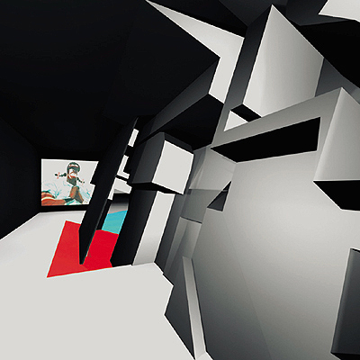
Malgosia, www.sirius.com/~sstark /fw/fw3/0489.html Most architects consider graffiti artists natural enemies. But not all of them. Dutch architect Marc Maurer (1969) deliberately searches out cooperation with graffiti artists. The way they appropriate and use certain parts of the public domain—often surroundings designed by architects—fascinates him, as does the question of what a marriage of love between both parties would be able to produce. Maurer, of the firm Maurer Engineering Architecture and Media, is a big fan of rap, hip-hop, sampling, media and street culture, and has been anxious to find a way to combine these worlds ever since he finished his studies. So like many other VJs and musicians, he applies the method of cut-and-paste—a method invented by the writer and poet William Burroughs and which has again become useful and popular. He tries to create something new and different out of found things by editing, recycling, reshaping and combining them in unexpected ways. Thanks to the digital revolution, we now have a wider range of possibilities in montage, collage, sampling and reproducing than ever before. Many of Maurer’s projects are based on this principle. The research he is doing for his Ph.D. at the Technical University of Eindhoven (NL) is a specially developed search engine that enables architects to search for parts of the production process instead of searching for an entry, a product or a material as is done now. The use of processes and techniques in uncommon ways leads to innovation and the development of new products and materials. Using this method a designer can “collect” the design together by shopping through the database, not as a passive consumer who works with the current techniques and materials, but as a self-assured and (inter)active Internet consumer used to custom-made products and services. It was therefore natural for Maurer to collaborate with graffiti artists. This time the point is to make something that already exists into something new, to translate one medium into another. And the tags by Delta and Zedz, two internationally known graffiti personalities who have been active since the 1970s and have also made a name for themselves with their graphic designs and T-shirts, are in themselves extraordinarily dimensional. Their work is a kind of typography suggesting three dimensions, calling to mind the architectural imagery of sci-fi movies and computer games. Zedz’s graffiti pay striking attention to structures as Delta’s reminds you at times of product design. The decision to translate these tags into 3-D objects, where the signature of the graffiti artist is the starting point for not only the exterior but also for the ground plan, is less extreme than it might at first seem. There are even more similarities. Like the work of certain architects and designers, graffiti art is about style, rhythm, feeling, and atmosphere. The idea of styling movement incorporates the domain of industrial design. And leads us back to architecture once again, for the worlds of industrial design and architecture are getting closer and closer now that more and more architects are starting to design their own prefab elements. The foundation for a “graffiti-related architecture” was laid in 1998. That same year Maurer and Zedz designed the villa Masterplan, in collaboration with Delta, and Zedzbeton, a 50-meter-long, multicolored piece of street furniture. Graffiti, camouflage techniques and dazzle paintings were applied to the exteriors. In both designs the operations necessary to translate tags into architecture seem minimal; standard forms of graffiti are still easy to distinguish. Connoisseurs immediately recognize the name and personal style of the artist in the 3-D models. The media and colleagues were excited by these designs. The principle of applying the method of cut-and-paste to architecture and youth culture was an instant success. The attractive, computer-generated pictures of both buildings appeared on websites and in professional journals. Zedzbeton even won second prize in the competition Visionen in Beton (Visions in Concrete) organized by the German Architecture website BauNetz. Up till now none of the designs has been realized. But that is going to change. On request of the Rotterdam-based art space MAMA (a showroom for media and moving art) the design team Delta-Maurer-Zedz developed a pavilion that will actually be built next year on the occasion of Rotterdam 2001, Cultural Capital of Europe. To the goal of blending graffiti and architecture MAMA has added one more: the wish to develop a new kind of exhibition space with more possibilities of showing art and culture, and, even more important, of experiencing them. P(avilion) 2001 is therefore not only a tag you can walk through, it is also a huge 3-D game the visitor can explore and even play with. A signature in three-dimensional space that reacts to visitors, that lets them in or shuts them out of certain spaces according to its (programmed) “mood.” “A completely new kind of space suited to admit all kinds of crossovers between art, design, fashion, music, and street culture. All experienced with the senses,” enthusiastically explains Boris van Berkum, MAMA’s artistic director. This adds content to the archi-tag-ture that fits it perfectly. Form and content come together in a building meant as an expression of the processes taking place inside: the colliding and fusion of disciplines currently taking place within art and culture everywhere. P2001 is a proud new addition to a series of experimental art spaces, like that of the deconstructivist roof pavilion on the Groninger Museum in the Netherlands designed by the Austrian architects Coop Himmelb(l)au. It consists of a floor that seems to break up into fragments; where no one can say exactly where the roof ends and where the floors and walls begin. Or the Guggenheim Museum in Bilbao by architect Frank Gehry, who used computer software meant to design airplanes to create a building with a spectacular outward appearance. In all these cases architecture was not only conceived as the art of building but also as visual art; techniques and processes lent service to the final image and feeling. And for Maurer there is even more to it. This kind of physically perceivable 3-D game matches his desire to influence the behavior of the user much more deeply. Like a DJ, he wants to play with moods, atmospheres, and behavior. His favorite nickname is MC: Master Copy; or Master of Ceremonies, like the nightclub entertainer that goes by the same label. Loving graffiti as an architect means more than looking for new forms, Maurer explains. “The emphasis on form and samples seems contradictory to architecture and design, a discipline that asks for attention to context, site, light, and the user. But because of all the prefab components that the building industry offers, architects have become samplers anyway. Apart from that, samples do have a communicative function: familiar images help to catch the attention of the spectator and keep it.” Furthermore, taking images and forms as a starting point is also a great way to break through well-established structures. In the villa Masterplan and P2001 the standard practice of separating private zones, public zones, and infrastructure is done away with and transformed into a situation in which all spaces blend into one another. Users of the villa cannot walk directly from the entrance to the living room without passing the kitchen and the bathroom. “The inside of the villa is a bit savage,” Maurer smiles. “But the privacy they lack inside is compensated for by the exterior: The strategic way the windows are placed and the dazzle and camouflage painting on the outside give them a lot of intimacy.” MAMA showed the models last summer in Rotterdam. The designs can still be seen on the Internet at http://masterplan.ooo.nl/p2001e.html. The reactions were extremely positive. Lovers of art, architecture, skate culture and graffiti from all over the world could not wait to use the Zedzbeton or the P2001, to skate it, to put graffiti on it or only to see it. “The concept of graf-designed architecture opens up amazing possibilities for both the graf-artist and the architect and a greater understanding of what graffiti is meant to be about,” emailed Steve from Falmouth to the website. “If only this open-minded approach were adopted by other disciplines we would see more exciting projects develop that questioned our notions of what a building should look like.” We will know next year what it’s really like to stroll through a 3-D signature. "
01.04.2000
Recommended articles
|
|||||||||||||


Comments
There are currently no comments.Add new comment