| Zeitschrift Umělec 1998/6-7 >> Šípek versus Přikryl | Übersicht aller Ausgaben | ||||||||||||
|
|||||||||||||
Šípek versus PřikrylZeitschrift Umělec 1998/6-701.06.1998 Lenka Lindaurová | architektur | en cs |
|||||||||||||
|
New gallery spaces in Prague or other big cities have not appeared for a long time. They were always made through reconstruction of already existing spaces. During the lengthy reconstruction of the Modern and Contemporary Art Collection of the National Gallery in Veletržní palác, the Czech Fine Arts Museum opened its House at the Black Madonna, the Municipal Library and recently, at the time when Veletržní palác is trying to redo its permanent exhibition, the House at the Golden Ring. These are, however, institutions run by the state.
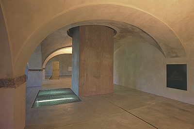
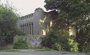
Yet, this year saw two monument reconstructions being finished and handed over to use for art exhibitions: Prague Castle’s Picture Gallery designed by architect Bořek Šípek and Benedikt Rejt Gallery in the town of Louny made by Emil Přikryl. On the first sight, the two projects seem incomparable. Both of them, however, serve art and both of them place high demands in their own way. Prague Castle’s Picture Gallery has a long and turbulent history and serves to the Rudolfinian collection. It is determined by a number of reconstructions – most of the important ones were carried out in the course of this century. The most acclaimed Castle architect Josip Plečnik had not have the time to intervene with this space very much, making round windows in the northern wing of the former horse stable only as the space was meant to be turned into representation area. Otto Rothmayer was the one who made most radical changes here but his interventions were implemented and then redone throughout one single decade – the 50’s. The current reconstruction was continuing mostly in their tradition. In 1996 the Prague Castle Management came to the decision to reconstruct the Picture Gallery according to Bořek Šípek’s design who has been improving the Castle for some time (entrance to the President’s offices, bridge over Chotkova Street). The reconstruction was assigned just before the law stating that contracts over 100.000 crowns ($3,500 US) had to go through a tender was approved and designer Šípek came to a very lucrative contract that would leave clear marks in the history of one of the most closely watched Czech buildings. Šípek is a professional but his work suffers from one impediment: postmodern macho character that lacks timelessness. This, surely, will be clear only after some time but we can already – in confrontation with previous reconstructions – find some evident mistakes. The most obvious of them is something I would call stuffy self-presentation the architect is using to attract attention to himself, to his playful and talkative creations while downplaying visuality of art works themselves and the interior as a whole. The Renaissance horse stable with rolled vaults – one of them hiding a very complex system of square cartridges – are so visual on their own that it is not necessary to recreate them in any way. Colorful walls form bearable and fashionable decor and at the same time subdue light that is harmful to ancient works. The parquet flooring composed into squares is also all right and Ingo Maurer’s lights (a sort of double-layered rectangular pancake) are excellent. Their placement on the edge of the walls and vaults in horizontal position makes them invisible so the viewer can only see a lit vault but is not disturbed by the source of the light. The need of seating and additional light was solved in Šípek’s way: aggressively green, limping benches of round shape, massively upholstered with a step and a carpet in the middle accompanied with a marble table and black lamps. His object feels pleasantly ugly, his furnishing of the Picture Gallery has the feeling of a pseudo-revolutionary exhibition. The entrance room to the horse stable got a stone polished floor reflecting lights of two and only windows to the Jelení Příkop and is dominated by reconstructed ceiling by Otto Rothmayer, painted in blue with golden decoration. Šípek gave in to the original as he found the symbol of three-corner blossom appropriate and he used it also for the golden railing and handles on the doors. It was however useless for him to install a heavy railing construction made of massive metal with horizontal surface (repeated also on the door frames) which only functions as a helpful element for the wheelchair platform. Rothmayer’s hall called Karnak with a forest of black columns which was closed in 1959 is now separated, creating two spaces: a café and a part of the Picture Gallery. At the end of the café where Šípek’s design raped everything possible is a view of original foundations of the Virgin Mary church from the 9th Century placed in a kitschy staged wall. Šípek’s style, however, is not disturbing in the café and in fact has its place here: everything holds together as to the style and even material maintains certain sophistication. The strange thing is that nobody is willing to operate the café (sic! at the Castle) since the gallery attracts very few people. The entrance hall and two smaller exhibition halls are pleasantly resolved as to their color and, with the exception of a few Šípekesque curls (door, chairs, tube-like golden lamps) they are easy to digest. One cannot deny that the reconstruction of the Picture Gallery was carried out in a broad-minded, even bombastic manner which naturally goes with head of states’ offices. The head of state also has a right to choose his collaborators and assign them to create conception of the Castle in their honorary post. The architect came up with the conception and the state paid 40 million crowns ($1,380,000 US). Surprisingly, a more broad-minded project which a Czech viewer has up to now had a chance to see only in rich German and Swiss cities suddenly appeared in a small town. The town of Louny managed to reconstruct the local gallery space for 14 million crowns ($483.000 US) only, a project made by Emil Přikryl. Reconstruction and finalization of this former brewery links to previous unfinished attempt from the totalitarian period which, naturally, didn’t make any sense and was thus ended in 1988. When approached by the Louny Gallery, Přikryl had been working at the known Liberec construction company SIAL. Similarly to the previous case, a tender was not organized for this reconstruction as the law at that time did not require to do so. The reconstruction has lasted for quite a while (three years) due to lack of financial sources and the architect had to work with a small local company. His local collaborators had to meet his high demands and make literally home-made parts. The visitor, however, has no clue that there are now big foreign companies behind all the elegant details. The reconstruction needed to tolerate only some historic elements of this often rebuilt construction (vaults and columns in the basement). The only other limitations represented financial resources only. The monumental, strict and functional building can nevertheless be compared with similar constructions Germany. The entrance is defined by simple metal gate and a front wall without any disturbing element. Light at the entrance part is coming through round tunnels in the roof which, from the outside, look like miniature observatory equipment. The main hall and entrance form strictly geometrical spaces determined by ashlar shape: columns, cash-register, a concrete tunnel of the elevator that cuts through all the floors (for the time being the first basement level is open to public, two remaining levels are still to be finished). Cast iron heating at the entrance is attached horizontally and painted black which makes it look a bit like objects by Donald Judd. The architect keeps the spaces adjacent to this main area (side spaces, stairways, tower, etc.), only changing their volume and proportion by utilizing light vistas, experimenting and generally making the strict geometrical shape of the core of the building more interesting. Round windows often appear in these side spaces, the walls are star-shaped, columns are suggested and even a vista to a stairway appears here. The destroyed interior of the corner tower gave way to a visual object that resigned to provisory functions. The internal architectural corpus is ending under the roof with the edges lined by daylight. A concrete prism erotically moves through a round opening to the second basement level which still boasts with Renaissance vault and columns. One large hall here is surrounded by two smaller spaces. One of their interesting features include different height of the floors and a ramp-like entrance into the lower part of the spaces. This unusual solution provides great service for the works exhibited here: the room was vaulted from the floor and by lowering the floor, new walls were created. The internal parget has “humane” natural form in the color of concrete – in a smoothed out form it is also used for the floors slightly floating in the space as they are not directly attached to the walls. Electricity circuits and switches are hidden in little canals in the floor covered with a removable metal plate. The remaining parts and equipment are also made of metal: technical lights on platforms, railing, handles and door frames, wash basins and faucets. The space lacks any malicious intrusions in the form of tubes, electricity circuits in the walls, technical tricks that would take away space from the art works. All the technical tools necessary for operating an art space are neatly hidden in closed spaces in the walls while fire extinguishers are admitted with full force. The building’s interiors, however, are not as sterile as, say, BP’s gas station toilets. Human traces are visible everywhere. The space does not have the feeling of a spaceship but rather a medieval cathedral. The permanent Louny Gallery’s exhibition is known for its qualities and fits in the building perfectly. Přikryl’s project respected the collection and visitors in the first place. Sýkora, Mirvald, Kubíček, Kratina, Malich, Boštík, Šimotová, Kolíbal... they all appear in an extraordinary place whose qualities are not unfortunately a standard here. Placed on an entrance area in front of the building are nine bare columns made of ordinary gray logs, filling up space that is dedicated to a building on street level to be built in the future. The two and a half meter high metal signs bearing the gallery’s title are surprising at the first sight, unusual at the second and interesting at the third. While some locals may be at loss visiting the gallery, in the context of world architecture, the building represents a well-performed reconstruction with overall conservative function. In a situation when Czech art is often exhibited underground and state galleries are becoming sterile closed institutions, the Louny Gallery is more of a rarity which should gain from this unique position as much as possible. It was born at a time when monsters like Guggenheim Bilbao are constructed while art is moving into empty buildings and factories. In Louny, something in between created a meaningful gallery. Finally: why am I comparing Šípek and Přikryl? The above text suggests their two opposite approaches: an exhibitionistic one and a reflexive approach. Šípek’s project represents tourist’s mentality of the Castle with general disability to think in timeless terms while Přikryl’s reconstruction is a clear example of thinking of the future with regard to realistic possibilities, yet with an effort to maintain high quality. Translated by Vladan Šír. (pages 16 through 19)
01.06.1998
Empfohlene Artikel
|
|||||||||||||
|
04.02.2020 10:17
Letošní 50. ročník Art Basel přilákal celkem 93 000 návštěvníků a sběratelů z 80 zemí světa. 290 prémiových galerií představilo umělecká díla od počátku 20. století až po současnost. Hlavní sektor přehlídky, tradičně v prvním patře výstavního prostoru, představil 232 předních galerií z celého světa nabízející umění nejvyšší kvality. Veletrh ukázal vzestupný trend prodeje prostřednictvím galerií jak soukromým sbírkám, tak i institucím. Kromě hlavního veletrhu stály za návštěvu i ty přidružené: Volta, Liste a Photo Basel, k tomu doprovodné programy a výstavy v místních institucích, které kvalitou daleko přesahují hranice města tj. Kunsthalle Basel, Kunstmuseum, Tinguely muzeum nebo Fondation Beyeler.
|










 New book by I.M.Jirous in English at our online bookshop.
Kommentar
Der Artikel ist bisher nicht kommentiert wordenNeuen Kommentar einfügen