


| Umělec 2007/4 >> Melancholia X | Просмотр всех номеров | ||||||||||||
|
|||||||||||||
Melancholia XUmělec 2007/401.04.2007 Petr Brožka | fashion | en cs de es |
|||||||||||||
|
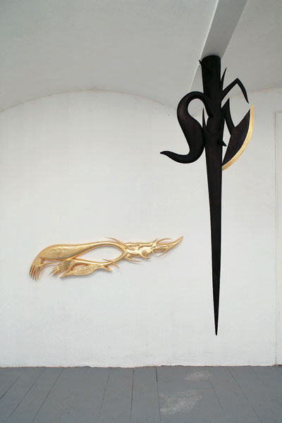
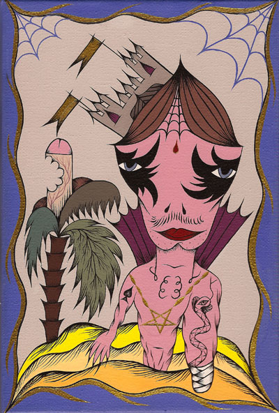
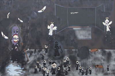
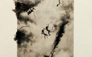
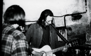
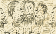
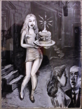
The renaissance of emotionality has been obvious in art circles for a relatively long time, but only subtly mirrored by mainstream society’s cultural conventions. In the real world, art already intermingles with complementary conventions. Expressed through the metaphor of "depersonalization," emotionality is paradoxically a simple expression of emotion. Therefore, it is often associated with the terms "posing" and "superficiality." In this case, these terms need not be pejorative. Bisexuality, slit wrists, and the gloomy corner of a room; these are emotions. However, they represent feelings that are real and which these icons symbolize. So icons naturally remain on the surface, and the only references or traces in the style of an otherwise abstract painting can lead the expressive media-trendy term, emo, is fairly universally applicable. Its content has great potential for further development. However, if we apply the label in this case, we are skating on thin ice, specifically when we associate it with expressions from independent DIY culture and the marketing-reclaimed fashion trend, which is how emo is commonly presented today. But at the same time, we create its own original interpretive domain. Thus a trinity of mutually-participating tendencies is created. One of them is the subcultural emo. This has been associated with the overseas music scene from the mid 1980s. At roughly the same time the fashion trend, moe, not unlike commercial emo, was beginning to take shape. Moe is an abbreviation of the word "moeru" which means "burn or burn down." It is understood as an emotional state. The word itself described a feeling of enthusiasm for characters from animated, manga and computer games and also a specific feeling of kindredness with them. This was characterized by taking on an image of a specific character, oftentimes even their characteristic traits (here we can find a relationship to cosplay). In Japan this represented a very popular cliché, the comic hero on the street. An outcast without basic social ties, who stands face to face against silent, elusive evil. This preconceived image oscillating between "goth" and elitist punk surprisingly built on traditional Japanese cultural expression. It drew from Shinto reserved joie de vivre and wistful inherence. In Japanese classical poetry, this is referred to as aware. The beauty of sadness, or identifying with a lone tree often liberates a person from negative emotional experiences. When feelings are pronounced in these references, they are separated from any factual tenacity. Part of them chip away from the surface of the object to which they are related. Commercial business bets on such iconography in clear, understandable forms. Making use of commercial visuals and language is already a tradition in art and this use is generally accepted. This is the way some of the best-known artists, like Yoshimoto Nara, Takashi Murakami or, from the younger generation, Junko Mizuno, react to the moe phenomenon—a phenomenon that, with the borrowed language of media culture and subtle shifts, transforms itself into its own style. Others like Jamie Heweltt or Simon Legen have actively been involved in the face-lift given to this commercial trend and have given it a desired touch of independence. The third interpretation of it, one of simple visuality, draws on both previous versions and in the art scene is hard to figure out. The visual emo is the center point where all the fibers are woven together. Each movement has its mainstream. Its peripheral forms often grow into its direct opposition. They tend, however, to be bearers of good energy and the cultural matrix defining the trend’s future shape and development. Artists' subjective aversion to categorizing their work forces them to weave webs in the titles of their creations, using titles like A Post-Romantic Depression Inspired by Comics, and look for their definitions vis-à-vis an official movement. This, after all, is understandable. This is a deep-seeded classification of trends in the global art scene and not just a peripheral revolt. In Prague, there is a desire to create a subcultural platform intersected with the traditionally melancholic Czech scene. This resulted in a distant "Western" generosity alongside the subliminal "Eastern" social reaction in favor of personal introspection. The gallery AM180 is the focal point for integration of this phenomenon into the Czech art scene. But the respect achieved by its above-genre activities will simply not suffice in order to profile them, from a creative angle, as part of an original subcultural movement. The siblings, Jakub and Anežka Hošek, remain long-term promoters of this movement. They founded the AM180 gallery together with Štěpán Bolf, Dan Dudarec and Markéta Wilems Pecková. The circle of artists close to them, including Ladislava Gažiová, Marie Hladíková, or Johana Stahlichová, use this aesthetic as only one of the media layers they work with. Although, for the most part, they draw from one, common source. This fact precludes how individual lines of expression easily and mutually combine and harmonize with one another. A clear example is the joint painting by Jakub Hošek, his sister Anežka Hošková and Ladislava Gažiová called Melancholía II. The underlying visual firmly holds the picture together, while at the same time individual points of expression weaken it. That which normally in individually authored paintings has logic and a latent complacency is revealed in Melancholía II as merely a formal style. What’s more important, though, is the logic of this step. Each synergy has a tendency toward manifestation. The picture is also defined ex-post by the point of view. That is, the paintings by the Hošek siblings are more the manifestation of a concrete subculture than self-determining entities. The work of Ladislava Gažiová finds itself in a slightly different position. Her unaffected style tends to get lost in the work Melancholía II. But as a result, it acts as a valuable accent. The technique of stenciling is used freely and distances itself from the "precise production" of Jakub Hošek. The elementary buoyancy and also the credibility of the work is reinforced by a personal story. In some paintings, it is even evident where the story ends and where the artistic license of EMOticons takes over. The series from 2004-05 contains, perhaps as by happenchance, Ms. Gažiová’s strongest, rawest and possibly even most honest works: paintings that drew notice on the artistic scene. Her openness to diverse impulses, something typical for young artists, the tension and expressiveness of the gesture generally distances these works from formalism. The themes woven together by these images can be described as "involuntary connection." The figures created by accidental stains are tied to electrical sources, to crates with unidentified content, or appear to stand in a state of hypnotic helplessness hooked up by wire appendages of space and thought. The absence of the "element of good," the time lines and the dominating gray color evoke rigidity and impotence. The main motifs of wires, ropes and cables are portentous. As is the fact of irrefutable connection. At the end of the series, the figures, which are similar to the phantasmagorical beings from Jim Woodring comics, eventually receive human forms. This just goes to underscore the show’s emotional iciness. Fears about possibly mixing up the content by subsequent quantification need not be substantiated. On the contrary, a certain serial aspect could help to study their deeper potential in greater detail. However, the artist does not want to get stuck in positions that she herself does not fully identify with. The use of typical attributes of Roma life, such as violins or perhaps a suitcase, in her later paintings seems rather calculated. However, narrative and purposefulness are important aspects of the folk creations that Ladislava Gažiová uses for inspiration. By reducing the painting to a simple composition of those attributes, she takes away, in many cases, from the impressive impact, typical for her paintings from 2004-05, in what appears to be an intentional manner. In relation to her earlier and later works this formal change, tied to a change in the iconography of that period, is more easily understood. It’s as if Ladislava Gažiová had already got the worst out of her and replaced limited agony with nostalgia. It’s not bothersome that her version of nostalgia is pathetic. It’s rather her unified civility in certain pictures from this series that is problematic. In the painting Bloody Rain (2006), One can already feel an attempt to detour into imaginative lyricism. The blend with art nouveau stylization proportionately balances the weight of the aforementioned subcultural formalism. The artist again opens her pictures with a blemish of sadness. She arrives at the point where an artist in the emo domain begins to feel limited. This is the previously referred to lyricism. Through this state she could, in the future, offer us the same strength and evilness like that with which she once created. Anežka Hošková’s pictures are closer to illustrations from really weird fairy-tales that always have sad endings. They are stories of loneliness and misunderstanding. Her earlier works from her first year (at art school) create a similar atmosphere. The image of a friendly hug for animals in infantile (žužu) colors recalls a plastic baby rattle that we would give children so that we wouldn’t have to pay attention to them. Loneliness and hidden self-deprecation remain her motto even in her contemporary works. The melted animals have been chased out of Anežka’s kingdom, which is overgrown with thorns and cobwebs. A gallery of decapitated heads integrated into a background of penile towers mix with civil scenes or impressions from the Easter ceremonies in Spain, a tradition that for us has an uncommon structure. The tender and barbarous sketch lines together with the suppressed colour scheme give a clear outline to one of the aspects of Anežka Hošková’s understated yet emphatically lascivious surrealism. The ambivalent relationship that Anežka Hošková has to her paintings can be expressed by the metaphor of a girl's diary. Its features coded in formalist pictograms hide an urgency, as if they were only made as an unimportant accoutrement to the promotional work of AM180 or the Indie Twins: a group Anežka created with her brother. The symbiotic visual language of the Hošek siblings is best expressed on the graphic designs they use to promote the gallery and concerts. Unfortunately the artificial gap between graphic design and art is seen in the Czech Republic as being very wide. Communication between these two media is focused only on their practical framework. Compared to the quasi-street decor of Jakub Hošek, Anežka Hošková’s pictures perhaps, in fact, most express a refusal of determined artistic expression. The curtness of the stories, the directness of the icon and the composition itself all reference inspiration from applied design. This is close to graffiti and to the universal allure of comics in combination with Art Brut. If we shift our focus to a strictly modernist viewpoint, we will see how inspiration from outside the gallery circuit is a bit tricky. It’s actually impossible to create a work of art that could withstand comparison to the developed graffiti scene, comic strip masters and the rawness of other painters. These trends are historically different from gallery art. They are viewed in different correlations, and most artists do not make a credible impression when working in these genres. Hošková’s largest handicap is that she is an artist. If we turn off the modernist spotlight, then we cease to view this as a problem. The artist herself does not search for anything. She looks to resolve no problems. She simply paints. This simplistic approach is always impenetrable and hard to assess. Anežka Hošková has achieved a clean format, where authenticity prevails over originality and is fully comprehensible in the international context. In his pictures, Jakub Hošek, references drawings to the point that even the tugs of the artist’s pencil is subject to reflection. His register of contrasting lines includes both scales of nervous breaks as well as several types of "bloatedness" and "fuzziness." However, he strictly leaves out elaborate, calligraphic gestures. He usually reproduces lines on the canvas by means of stencils that rule out serial use. So instead of joining sketching and design, he distorts both concepts. In addition to his primary visual effect, Jakub Hošek also sorts out the spatial relationships of his paintings and works intensively on form. The text created is modelled into dramatic evocations of specific subjects and texts in pictures, or in his most recent work he has adapted them into 3-D objects. Hošek’s work has had a sense of detail since his early environmentally-themed installations and objects. His clear development toward decorative abstraction has been accompanied by change in his understanding of color. He has gradually expanded his basic color palette to include more exclusive color arrangements and gilding. This decadent vanity however continues to hold on to the visual of the global subculture that Hošek has already transformed to a format acceptable to even Czech intellectual circles. The lucidity and sting documented, for example, in the film Voir un ami pleurer (2002), was broken down in his pictures from 2007 into a decorative mess, whose fragments cease to be relevantly useful. Drops of blood form his earlier work, Knife play I, II (2001), and the streams of blood from the following series are today replaced in his sculptural work by a velvet black color. Should he have to evoke distantly the wings of a crow, this means that the battle is over. The reduction of visual enthusiasm can, in this case, be seen as an expression of a certain maturity. His sketch lines further lead his shape-speech and, together with the gilding, they make an object for hanging into a gesture that briefly summarizes visual significances. Hošek takes on the role of a classicist in this genre on the Czech scene. But even the "second wave" always arises when something works. A second wave is typically the initial sign of an emerging phenomenon, which is what emo most certainly is. With the directness of this "trend," it has actually developed its own scheme: but this already in the form of sarcastic quotes (i.e. in the works of Jan Sytař). The apparent self-imaging here clearly lacks an internal conviction characteristic of artists in Jakub Hošek’s circle. But this isn’t likely to be a bubble that will quickly burst. The potential viewership is extensive, and in 10 years it will definitely influence the environment in which artistic operations are taking place. Partly nostalgia and partly the market’s invisible hand that keep this phenomenon going as an alternative to contemporary trends. The coincidence of the mutual adjusting of the gallery and creative climate, the fast pace with which global trends fade and the slowness with which the state-owned gallery environment reacts, all play into the hands of collectives like AM 180. Prague’s cultural dimension puts us in the role of humble recipients of norms defined at international shows. Confrontation is only possible with trends of vast scope, and this is true both on the Czech and international art scenes. The Prague scene’s immutable status quo, its creeping futility and operational uncertainty are all a formidable foe. Jakub and Anežka Hošek and Laďa Gažiová are fighting it with the most unseemly of weapons: melancholy. 


01.04.2007
Рекомендуемые статьи
|
|||||||||||||


|
04.02.2020 10:17
Letošní 50. ročník Art Basel přilákal celkem 93 000 návštěvníků a sběratelů z 80 zemí světa. 290 prémiových galerií představilo umělecká díla od počátku 20. století až po současnost. Hlavní sektor přehlídky, tradičně v prvním patře výstavního prostoru, představil 232 předních galerií z celého světa nabízející umění nejvyšší kvality. Veletrh ukázal vzestupný trend prodeje prostřednictvím galerií jak soukromým sbírkám, tak i institucím. Kromě hlavního veletrhu stály za návštěvu i ty přidružené: Volta, Liste a Photo Basel, k tomu doprovodné programy a výstavy v místních institucích, které kvalitou daleko přesahují hranice města tj. Kunsthalle Basel, Kunstmuseum, Tinguely muzeum nebo Fondation Beyeler.
|


DIVUS INTERNATIONAL:
Divus at Unearthing the Music in Lisbon
DIVUS LONDON:
My Itinerary Has Been Monotonous for Quite a While
DIVUS LONDON:
Zinovy Zinik: On Sound Monsters


 New book by I.M.Jirous in English at our online bookshop.
Комментарии
Статья не была прокомментированаДобавить новый комментарий