| Umělec 2005/3 >> Jazz from Sun Tlen | Просмотр всех номеров | ||||||||||||
|
|||||||||||||
Jazz from Sun TlenUmělec 2005/301.03.2005 Tomáš Pospiszyl | studie | en cs de es |
|||||||||||||
|
Artists on the boundary between the fifties and the present day
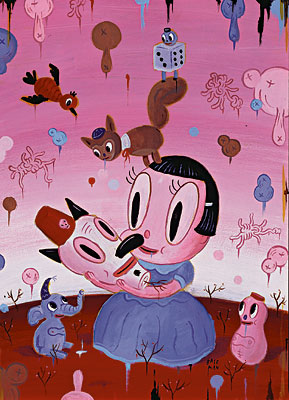
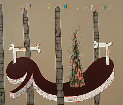
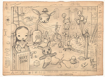
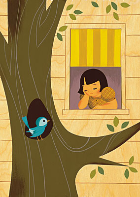
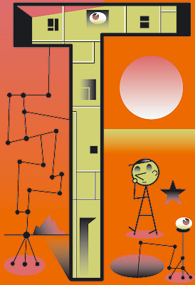
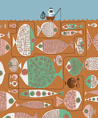
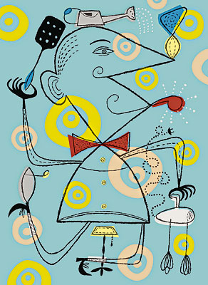
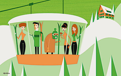
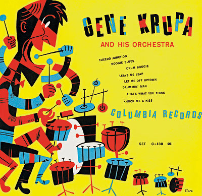
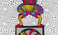
between high art and design between traditional technique and computer technology between painting and story A lot of ink has been spilled over the fate of painting lately. Its “new waves” are declared nearly every day according to marketing needs of gallery owners and curators whose rhetoric reflects little of any real crisis or revival within this medium. One thing is certain: painting as such no longer exists; there is a whole array of approaches that can vary immensely from each other in the end. However, some purpose in painting persists as trends continue and new ones arise—and these can be clearly defined. Here are some painters and artists—mainly American—who have in common an admiration of the Modernist style of illustration, design and advertising graphics of the fifties. They introduce this inspiration into their works which can be commercial or free, unaware of any significant differences among these fields. (These distinctions are strongly stressed by many art critics who, with minor exceptions, refuse to deal with these artists.) The liberal attitude of these artists is demonstrated in their relationship to the techniques they use. It can be traditional acrylic painting, but the art works are also created with the help of computer programs. Something else that connects these artists is the similarity of the applied art to the form of illustrations and comics. Emphasizing story and narration, these artists present an opportunity to build an entire parallel world complete with its own laws. The historical styles can also carry us to the nostalgic past and, creatively used, can even subversively evoke a reckoning not only with the art programs of our ancestors but also of the present. You will probably not find the name of American Jim Flora (1914–1998) in books on art and design of the twentieth century. Until recently he was forgotten also as the author of art covers for popular gramophone records or as a children’s books illustrator. Jim Flora’s style bears the stamp of his time. The forties and fifties was an era of jazz and a belief in rapid technological progress that would open up the way to space for humankind. In the belated Czech environment, we can approximately define this style with the term “Brussels.” Aesthetics was remarkably international and its essence was the adaptation of avant-garde exploits, such as Cubism or Surrealism, for the purposes of mass design and architecture. Flora’s album covers are inspired by Picasso and Klee but simultaneously by the period’s magazine cartoons (we can find typical ways of showing heels with a whole range of illustrators of the fifties, including Czech ones) and a somehow psychedelic sensitivity of the atomic age. They also carry something ironically cruel, something that in our conditions remotely resembles the cartoon humor of the Czech Šmidrové artistic group. Jim Flora designed his last gramophone cover in 1956 at a time when photography had finally entered this field in the US. He went on writing and illustrating children’s books withno significant success, and it was only in the last couple of years or months before his death that he became a cult figure for a small circle of collectors and artists who continued with his works. The most interesting part of Jim Flora’s output was presented last year in a book by American music popularizer Irwin Chusid. Jim Flora’s output is interesting not only for perverted admirers of out-of-date fashion trends. Furniture styles of the fifties found their way into boutiques and antique shops long ago and recently, the graphic retro style of the same period has been experiencing a huge comeback in the field of commercial illustration, particularly in the US. The organic shapes, pastel paints and Picasso-like figures have reached our collective memory for good; it is not only advertising that draws upon them but also other spheres of art. For that matter, the response to the works of Jim Flora shows that it can be very difficult to distinguish between advertising and free art, and perhaps even useless. Among Flora’s admirers are Mike Bartalos, Tim Biskup and JD King. JD King is a pseudonym of an artist from the US East Coast who works with computer graphics. His illustrations appear regularly in a wide range of major American magazines. Mike Bartalos was born in Germany, but had acquired his art education already in America where he now lives. Like JD King, he creates his works on a computer, but he also experiments with print on unconventional materials such as neoprene. He writes and illustrates children’s books, creates short animated films, and he has even designed a postage stamp. His book Shadowville complete with illustrations and typographic layout, resembles Zdeněk Seydl’s work from the sixties, or the successful attempts at modern children’s books from the Prague publishing house Baobab. Probably the wildest is the style of Tim Biskup who, apart from computer pictures, also creates acrylic paintings and frequently exhibits in art galleries. In his complicated scenes, old jazz musicians and beatniks come back to life, but so do nice hairy spectres and shy extra-terrestrials that stylistically resemble a psychedelic version of Zdeněk Miler’s Little Mole combined with Constellations by Joan Miró. Biskup represents an important part of a friendly community of like-minded artists who sometimes exhibit together. His wife is Seona Hong who, apart from her own work, creates for the film industry and makes backgrounds for cartoon-strips. The backgrounds themselves have the quality of self-standing works that nostalgically evoke animated films of the fifties and sixties. It is interesting to speculate why a similar style is so successful. The interior of a rocket equipped with a giant pre-historic screen and strange steam piping surely do not correspond with the ideas of today’s youth about what the appliances inside a space ship should look like. The result is a similarly ironically-historicizing effect that Karel Zeman used in his Verne-like movies. The author of a consistent retro style graphic design of the fifties and sixties is Melinda Beck. We can imagine her current illustrations—found everywhere from American magazines to annual reports of large corporations—being published in forty-year-old newspapers. Commercial success has been achieved by the artist Josh Agle, known as Shag; He started as an advertising graphic designer, but found out in the end that galleries had an enormous interest in exhibiting and selling his pictures. These works capture stylized scenes of an era when modern apartment interiors attempted to resemble flying saucers, upholstered and full of elegant society with nothing else to do but drink cocktails, listen to music and have a good time. Tim Biskup has exhibited several times with artists Gary Baseman and Mark Ryden; they have also created several paintings together. Baseman is probably the remotest from the graphic style of the fifties in his work and at the same time he is an author who is known also to a wider American public. His cruel animals and merry skeletons evoke Mexican folk art and come near the world of alternative comics. Apart from painting and magazine illustrations, he is also devoted to the creation of animated television programs, many of which have received Emmy awards. Children’s toys of his design have also met with success. Ryden is a remarkable and bizarre personality with the ability to create his own, slightly abnormal world—a deviant version of František Skála. Ryden is a collector of curiosities, and his paintings and drawings, mostly joined in large thematic cycles, draw upon Arcimboldo, Dalí and global kitsch. In them we can encounter bug-eyed little animals with blood, swastikas and prepubescent naked girls, all this in a combination resembling collages assembled from soft porn magazines and Grimm’s fairy-tales. Ryden successfully exhibits in galleries and has developed a circle of devoted collectors all over the world, and his works have been reprinted in the cult Japanese magazine Gothic & Lolita Bible. Uniting the works of these artists is not only the rediscovery and update of fifties style, but also in the general sense recycling of existing visual material. They use morphology and topics that have become a part of collective memory. These artists work with a historical style that they did not experience or co-create. For them it is something that they would find in their grandparents’ attics or in second-hand shops or used bookstores. Today, the fifties are modern and old-fashioned at the same time. They can bring back nostalgia for modernity, after naive technological optimism from The Jetsons series or from the anonymous monuments of the Soviet Sputniks in remote Czech towns and villages. Such artistic strategies based on the evocation of a “modern past” have also appeared in the Czech art of the nineties—an environment sensitive to the collapse of modern utopias. I mean for example Ivan Vosecký who used in one of his pictures Jaromír Drápal’s illustrations for the Soviet book Dunno in Sun Town. Sun Town is a Communist dream world where a new social order is wedded with technical conveniences. In Drápal’s illustrations it acquired the child-playish form of Brussels. Pavel Bařinka and Jakub Hošek draw upon the historical and present styles in their paintings less literally but no less efficiently. Their works have an illustrative character, in the good sense of the word, they are tied to the story which can be read from the pictures like from a single-frame comic. Czech modernist typography and illustration from the sixties have been remembered in Zdeněk Primus’s exhibition Art Is Abstraction. The connection between free works of the period avant-garde artists and the way they made their living was presented, most often in the form of the graphic layout of books and magazines. Czech typography at that time had achieved one of its high peaks, and it is interesting that modernist retro largely avoided our present graphic design and art. As follows from its title, Primus’ exhibition was focused mainly on abstract and avant-garde manifestations; it ignored the rich field of figurative illustrations and fields associated with the lower levels of graphic design. All this is still waiting for rediscovery. Let’s seek out modernist patterns of curtain materials, magazine illustrations from the first years of Mladý Svět magazine and the anonymous sculptural reliefs of suburban snack bars. All this is waiting to be incorporated into new works and new contexts. It is only a matter of time before the early works of Adolf Born and Oldřich Jelínek triumphantly re-enter Czech art, when the caricatures by Vilém Reichmann, Vladimír Hlavín and Jaroslav Malák from Dikobraz magazine from the fifties and sixties begin to be recycled and imitated. Brussels Modernism was one of the last universal artistic styles; it may very well await a similar renaissance as when the previously disdained Art Nouveau was rediscovered in the sixties. Most of the artists mentioned in this article have their own web pages that can be easily found by inserting their names into the Google search engine. 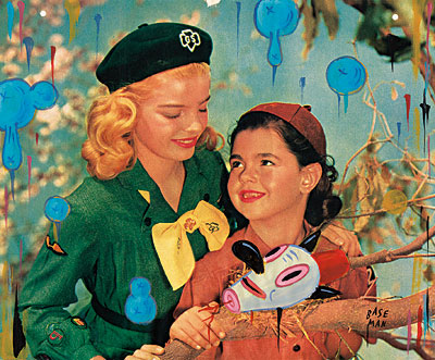
01.03.2005
Рекомендуемые статьи
|
|||||||||||||


Комментарии
Статья не была прокомментированаДобавить новый комментарий