


| Revista Umělec 2003/1 >> Kaprun | Lista de todas las ediciones | ||||||||||||
|
|||||||||||||
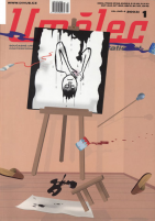
KaprunRevista Umělec 2003/101.01.2003 Jiří Ptáček | theme | en cs |
|||||||||||||
|
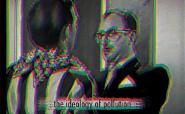
From time to time I get excited and have the feeling that I know Petr Brožka. When I have a moment to think in peace, my conviction loses strength. The thing is, I continue to be irritated by his mixture of sharp intelligence and endless self-irony.
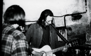
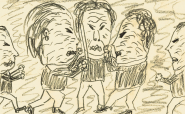
In the beginning, I asked him for an author’s postscript to his work, and I was surprised to receive an outline of an interview that he’d made with himself. In fresh language, Brožka paraphrased the possibility of how to express his thoughts. At the same time he summed up his lighthearted approach to them. Then he asked me to put them into an original text. Who, then, is Petr Brožka? An exemplary young artist, who, after his studies at the Faculty of Visual Arts in Brno, moved to the southern Bohemian village of Borovany, and in a little house opposite the local cemetery, seemed to forget about the concepts he’d brought with him. The rest of us, however, could not forget his unanswered invitation sent to Karel Gott [editor’s note: the Czech version of Frank Sinatra] to come to a presentation of his school work, which included a miniature ceramic Porsche, and his photographic series of the large designer “room paintings” he’d made to fit within the colors and textures of various room. Then there were the dozen tempera paper masks of carrots and shoes and other things he made as his diploma work, which, after donning them, pleased both the committee and viewers. The huge two-meter-high decoration ball sprayed with a black arrow that Brožka had brought from an industrial exhibition in the Brno fairgrounds also made an unbelievable appearance. As well as the industrial exhibition board painted with white clouds on a blue sky with an elliptical base collected from the same industrial exhibition for a presentation of Gallery Escort at last year’s youth Biennial, which was once again used as a kind of photograph stand for his colleagues’ work. A ready-made unable to make art action meaningful. A presence without the help of the surroundings to put it together. In Borovany, Brožka turned to canvas and paint. And during one year he painted the cycle Kaprun. Paintings with cubist morphology, filled to the frame with references to reality: mountains, clouds, snowboards and sunrises, formulated as complicated, organic collections of logos. In his notes, Petr Brožka explains the selection of topics in these words: “Kaprun is a resort in the Alps where I went last year with my friends. Real beauty. It is hard to compare it to anything else. Just excitement. During the rest of the winter, when I was suffering at home, I wanted at least to be remind of it. I can see it in these paintings, but in a specific form, it is untransferable. (…) By combining sport iconography with the language of abstraction, it becomes only partially readable. This means for artists who do not go snowboarding and for snowboarders without general knowledge of art history …” However the depth of Brožka’s expression should not confuse us. Not in vain does he claim to be a conceptual painter. “It is truly postmodern. The conceptual aspect is an integral part. But only as a story for a smile. Because of course no one is interested in what a good time I had in the mountains. My pictures are a narrative, but I do not mind looking at it as an abstraction. Anyway, they seem interesting to me. And I don’t think that the concept is redundant there. By a large measure, it becomes lighter when it is accepted here as conceptual kitsch.” But how does Brožka understand the individuality of conceptual kitsch? In his notes he returns to it several times: “It is hard to explain, easy to show. They are as numerous as poppy seeds. Art built on the principles of kitsch. And it is nothing negative. A general understanding of kitsch is based on connections: a romantic theme, an impressionistic style and naive production. You can do anything with this triple combination, and you would deserve no other label. Such a re-mixing of things is the foundation of the postmodern. It already became one of those postmodern cliches. It is so refined and so rooted in culture that any attempt to get rid of it causes you to nod in agreement. That is how it’s always been. Even today it is like that. Kitsch is like Tao — all present and indestructible. You simply start to exist with it and start to use it. As a thing that you distance from or as a popularizing element. Or you simply do not think about it. I am not one of those people who pointedly defends himself. But as a conception that was in the beginning so nicely non-committal, it cannot function like that anymore. There was simply too much of it. Even the cliche of postmodern irony has already assimilated with the art space. For example: if you make a strict concept, nobody really recognizes how you mean it. Whether seriously or ironically. And whoever has the feeling that something is worth thinking out is naive. The naivete in the execution, identical to the 60s and in the connection with the academics of that time, gives rise to exemplary conceptual kitsch. Only timeless wisdom can oppose the irony and ignorance of modernistic techniques. And is anyone curious about it nowadays?” The evaluation of modernism, however, had to happen only on a formal basis, and the awareness of its present reaches. What was left of the monstrous projects of the 20th century? Functionalism changed into the topos of purity, and surrealistic depth into the communicative subconscious in the everyday alternative of the pragmatic lifecycle — in fact, similarly irrational as the prematurely canonized trio Dream, Imagination, Association. Kaprun does not claim the right to rush about here and there, it only sways: 1. between an attempt at entertainment alternating between colorful segments and the distaste of building it on a colorful accent 2. between the perfectionism of the construction of an illusive space and a surface, pseudo-in situ ornament. 3. between precisely conveyed contour and its minimizing of mistakes and inaccuracy. The snowboard changes into a “Brussels” plate [Ed. Note: At the 1958 World Expo in Brussels, the Czechs took away all the awards in industrial design, and art. So now “Bruselský” style signifies pastel design.] in the same way that folk decor mixes with para-psychedelic variations of commercial brands. In other words, I have to constantly repeat what I’ve already told myself several times: they are entertainingly dull pictures with the clairvoyant will towards being that way. From a distance, but with an even bigger willingness, that’s how to approach the other quality of Brožka’s cycle: his tendency to make free use of the shape apparatus of cubist paintings. The initial stylization of Kaprun did not restrict itself to a specific art language, but Brožka, with typical hyperbole, comments on how he has found similarity with cubist syntacticity. Kaprun features dynamic elements that put together a specific representation in an otherwise abstract space, and at the same time they add dynamics to it. But they also become sophisticated variations on pop esthetics. We could bring it closer by employing the metaphor of bifocal vision. With one eye, we perceive civil themes, with the other the methods of cubist phrasing that, in one century, became the property of global cultural. That’s why Brožka can be courageous, even with other ironies towards the notion of commercially successful art. “…cubism is a safe business move. If in the EU they ask about our art, they will certainly prefer something that follows in the tradition of Czech cubism. Even if it’s a ridiculous tradition. The one that was before hi-tech, which is everywhere now in the world, moreover, with x-times more quality.” And proclaims: “Cubism — the right choice.” The similarity to a detergent ad is no accident. “However, this is also a conceptual pose. Just a joke. My work intuitively absorbs many traditional elements, but the final form must always be thought out in all the consequences. At least afterward. I paint something, and then I regard it for a long time and look for the things that are important for me. It’s no surprise that in the final stage I step out of the thought-out composition and the more obvious joke stops being funny. Rather than cubism, there is the surrealism of geometric forms. It is much more tendentious than the previous cycle. It absorbs the best of the conquests of Czech paintings from the 20th century.” When the art admits to being a business product and succumbs to contemporary demand, out of principle this does not drain it of quality. This only disappears when such an admission reveals itself as a moral imperative. Brožka searches for possibilities in how to do traditional painting with the experience of the human being today, without losing enthusiasm for the theme and accomplishment. He looks for the civil aspect that does not abandon contact with the sophisticated basis of western art. He searches for the comprehensible visual codes of perceiving reality, but uses them for the narrative transformation of the subjective world. And in this way he enters the young Czech scene and current trends as an individual with an independent language — something rare to see. 

01.01.2003
Artículos recomendados
|
|||||||||||||

|
04.02.2020 10:17
Letošní 50. ročník Art Basel přilákal celkem 93 000 návštěvníků a sběratelů z 80 zemí světa. 290 prémiových galerií představilo umělecká díla od počátku 20. století až po současnost. Hlavní sektor přehlídky, tradičně v prvním patře výstavního prostoru, představil 232 předních galerií z celého světa nabízející umění nejvyšší kvality. Veletrh ukázal vzestupný trend prodeje prostřednictvím galerií jak soukromým sbírkám, tak i institucím. Kromě hlavního veletrhu stály za návštěvu i ty přidružené: Volta, Liste a Photo Basel, k tomu doprovodné programy a výstavy v místních institucích, které kvalitou daleko přesahují hranice města tj. Kunsthalle Basel, Kunstmuseum, Tinguely muzeum nebo Fondation Beyeler.
|


DIVUS PERLA:
Lucia Dovičáková: What Else Do You Need To Destroy?
DIVUS PERLA:
PERLÍNO
DIVUS PERLA:
MDNN - The International Unrealized Ideas' Day


 We Are Rising National Gallery For You! Go to Kyjov by Krásná Lípa no.37.
Comentarios
Actualmente no hay comentariosAgregar nuevo comentario