


| Zeitschrift Umělec 2003/1 >> Dorka | Übersicht aller Ausgaben | ||||||||||||
|
|||||||||||||
DorkaZeitschrift Umělec 2003/101.01.2003 Vít Soukup | theorie | en cs |
|||||||||||||
|
Dorka
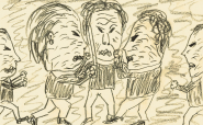
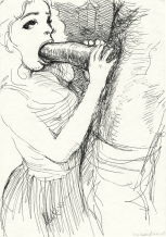
Dorka magazine was at one time in very good taste. It wanted to oppose kitsch. It was a guide for women, on how to make a cozy, tasteful home, how to dress fashionably, how to express a tasteful self and family. There were passages on how to make arts and crafts, knit, crochet, sew and do anything with whatever cotton or other leftover material there was to be found. Any sort of controversy on just what exactly good taste was could not be found on the pages of Dorka — good taste or the quality of commercial art was seen to be completely intuitive, dictated by the era’s parameters and therefore matter of fact. At the same time, or maybe because of it, a look back at an issue of Dorka today is a very bizarre experience indeed. Only with the passage of time is the comic nature and absurdity of that era’s then-beautiful home decor revealed. The wall decorations and patterns are influenced by the tale of a worn-out, chewed-up and spit out modernism, lace and embroidery make the unnatural sounds of folk art which was taken from the village to the urban environment of the 1970s and 1980s — is this some sort of personality mutation of the national taste in composition? People are clothed in the most impossible plaid clothing. Women forced to suffer the indignity of their own desire, men humiliated, denigrated, children innocently at the mercy of the bad taste of their parents. And at the same time it makes an impression in its own cute way — life should be pleasant and cutely decorated! Even Ruskin and his followers believed that beautified surroundings, clothing and accessories on and around us, beautify us and our very souls.41 In the case of Dorka, we are witnesses to the desperate attempt for any kind of positive impulse — logically, we must take into account the era’s context. And at the same time, in this banal common world, there are signs of romance:42 Escape to the inner self, to the intimate sphere, escape to the roots of humanity, to a faraway land (Norwegian sweaters, exotic patterns), an escape to the preserve of the untouchable world of a child. It is a romanticism of simple pathos and broad gestures, simple whatever political or simply apolitical society, a complement to Project Socialism, speeding to Communism and its own way of ironing out the nuances of a secure life. But are not these permed, painted women princesses, their male counterparts fairy tale heroes? And their children, are they not mythical elves? Does not each embroidered napkin bring to mind the fairy tale where the napkin attracts food to the table it is set on. And should not their pillows provide comfort for some pasha taking a ride on a magic carpet? The more dismal the historical context, the more desire is to be found for beauty and purity, however ceremonious, comic and impressive. Not to be forgotten is the application of history mutated into modernity — the visual conquests of Malevice, Matisse or Kupka become crocheted blankets, textile applications, which, say the professors at art school in Bratislava, can be made at home. The first and foremost function of Dorka is to make one’s surroundings more pleasant. Woman is half of humanity, whose main purpose in life is to maintain continuity, values, a safe home. And Dorka was created just for them — to form their being and with it the surroundings they live in. It does this in a very simple way: practical tips, advice, instructive and attractive photography, easy to imitate patterns. It gives women the feeling of beauty, harmony and security, of a relativity which allows a small spark of creativity in choice of wool. It helps to create a pleasant, virtual world, organized and functional, practical. According to Benjamin Kuras43 the main characteristic of the Czech disposition and the motor of Czech history is the desire for pohoda, the Czech word which translates loosely as comfort and coziness. If this is true, Dorka is the perfect mirror metaphor of this great Czech illusion. I don’t want to put down or support this illusion. But I do want to discuss it, because it is an essential part of my life and will probably always be. It continues, maybe in somewhat changed forms — it is suggested in the series Eternal Beauty, and in the motif of advertising leaflets and the magazine Betynka (which of course I will not go into — it would complicate the concept). Time has passed since Dorka was at its peak, of course, and this allows us to view the phenomenon with an important perspective which lets us see the whole problem more clearly and in greater detail. Better perspective usually gives greater perspective on any problem. It is true that in an era where a film such as Hřebejk’s Pupendo hits the theaters with such great anticipation, and when any number of nostalgic tendencies are alive and well, when design and creative decoration in pubs or dance parties is all the rage, such a theme could seem embarrassingly conjunctural. But retro nostalgia is definitely not my aim. It is and of itself nothing but absurd and banal, absurdity and banality, and when I do work with it, it is certainly not the main goal of my project. I want to understand the world of our mothers, who carefully hid various talismans in their closets. I want, through that understanding, to comprehend the world of my own childhood, and at the same time, the world of art and esthetics and my role in them — which has been for me up to now a great, dark secret. Dorka, in all of these points, gives me study material. In the following presentation, I would like to, with the help of the Čipek Method of Exposed Synthesis, put together all of the previously cited aspects and come up with a model of the painting exhibition, with all of the aspects that seem to be absent in most current exhibitions, and which I would like to enrich in the context of my doctoral work. It is of course only one of the possible models, a small but concentrated segment of my work, and it is definitely not afflicted by all the directions of my searching. I do want to use time and concentration to the utmost my degree program allows, to present this model in its most crystallized form. The original concept of Eternal Beauty was accentuated by contemporary prints. The time of its origin seemed to me, however, to be too close, the motif “Flaming Contemporality” reeked too much of social or even a socially critical concept. In the pages of Dorka I got dangerously close to the cult of Hrebejk. How to escape this trap, and not fall into a sarcastic appeal, nor into a nostalgic retro idyll? Allow me to apply at this time my universal cure, the Čipek Method: A — first extreme B — second extreme C — exposed synthesis: ideal condition D — compromise: dead zone E — reduced synthesis: expiration At point A is found “the language of Hřebejk.” This is a non-conflictual interaction with nostalgia, half-hearted criticism, a Czech ideal of the type, “What was, was” or “All we need is a little peace and quiet.” A big dose of half-hearted humor is important (of the type of our “Dear Svěrák”) as well as some good old Czech homemade fun. A little dirty talk is still restrained enough by doctor’s orders not to insult anyone. The lyrics of the type written by Hálkovský bring on the melancholy. Of course, Hašlerovský sentiment, even in the parody of the stork, must be present. The heroes are lamentable, however funny they may be. Not very good, but none too evil. The storytelling is traditional, acceptable, comprehensible.44 Now to point B: sarcasm, cruelty, raw and immediate reality, without glitter, even more cruel than it may appear. A more natural attack. Nihilism and skepticism do not allow for any instant solution, and if so, a Nietzschean solution of the cruel variety, a change in the Pope who was struck by a meteor, a shark in formaldehyde. Poetry and sentiment have no role to play here. An exclamation, a pounding neon sign expounding the rights of black homosexual women. Without the possibility of compromise, when humor, so sarcastic and bitterly foul — a cruel punk. A contrast of heroes, revolting, disappointment. Conflict and bitterness. Told in a completely untraditional way, almost willfully innovative, incomprehensible, unacceptable.45 At point E is found a phenomenon which I call “Flowing Art.” It has characteristics of both sides, both points A and B, but it is in a derivative, purposely pale form. Socially it is a bit frisky, any sort of gesture defeatist. It is the art of the easy game before it is released as art into the world. It can easily enflame and provoke, but it never does it in a too interested manner, nor too engaged. Always with a bit of purposeful nonchalance. In the words of Ivan Vosecký: “Art is the sleep in the eye of the Creator. An illusion in an illusion without base. Real art does not want anything. Death is necessary. No ecology exists. Besides that, I don’t know a thing. Ivan.”46 It is typical for Flowing Art that any of its actors can in the same breath ironize and relativize. A fictional parody in the third, which seems to me, begging your pardon, alibistic enough. If humor is present, then it can’t be too funny, or it must be at least masked. If there is some type of an appeal, then it must be parodized — at least in the visual form. If there is a story present, it can’t be too readable, and it cannot have a definite point to make, best to be somewhat mysterious. The form is non-violently violent, flowing in and out of reality. To be clear — I see this attitude as completely legitimate and in some inexact way reflective of today’s reality. My ideal is different, however — I would like to try to draw a line up vertically to point C using the Čipek Method, to get to an exposed synthesis, some type of extract of everything that is useful about A and B. Milan Knížák47 says that the definition of art is condensed nebula, and he goes on to revere the unclarity, imprecision and mobility/ability to move. He has also written: “I don’t even know what the heart and soul of art, or in art, means.” Well, I think that that heart and soul could be an attempt at a certain introduction of light or even further building of that nebula, a clarification of the unclear, specification of the inexact, reinforcement of the mobility, and that at least in my own creations. I repeat, I don’t want to establish some modern dogma. But I do feel that I am in some way stuck up in that nebula. It’s really very simple. The heart and soul of art is simply the ability to stand by one’s own and inner feelings through any doubts, external interventions and disappointments one might have. Even better, to search for those feelings continually, to keep them at close hand and under watchful eye, to refine them, worship them and be prepared to pray for them, to sacrifice for them, even be prepared to die for them if necessary. Nothing else makes any sense. This heart and soul neither stands nor falls with the concept of modernistic heroes and postmodern players. I believe that it is a permanent condition which gives meaning to the artistic experience. Application of the Čipek in Dorka Now I will attempt to use the Čipek on specific cases, with the knowledge of the risk that this entails. In picture 1 (see p. 77) we see a woman in plaid leggings, a jumper and soft shoes, next to her an exposed, plaid bag with a somewhat forced-looking easy way about it (or is it a plaid crab!?). Everything is elegantly matched in the red-orange-black colors of the German flag. Strong black lines and a combination of red and orange cross-stitch give the decor an almost excessive energy. Dorka adds comments to the picture as follows — please excuse the long quotation, but it simply could not be edited. In its entirety, it illustrates exactly the world of Dorka:48 Dear Girlfriends! Before you begin to read this issue of DORKA, I would just like to tell you all that any time period, any era, has its own wisdom which has been handed down by generations past. Our age, ruled by electronic computers, an era in which the faraway world is closing in on us, an era which symbolizes science and technology, this era is guarded heavily by the legacy of past folk art. This symphony of colors and patterns, a gentle, subtle picture of bygone days and life of the people, which has left its impressions of love, happiness and sadness, is inheritance and tradition. (…) When we reach our well-deserved weekends of styled wooden weekend houses, which we are restoring with love piece by piece, we leave our modern apartments and in an old country house we work on old spinning wheels, old-style hot coal irons and mortar and peddles made of copper. Instead of resting, we paint our fences and plant our flowers in the garden, we make fires in our old-fashioned wood-burning stoves and relax under our cuckoo clocks. All this, not because we want to escape the modern world, a world fashioned by progress. It is a short dream, the fairly tale of our mothers, the desire to see the forces which guide nature and take from all of this a peaceful repose. At the same time, we are able to admire the richness of the human fantasy embodied in the bold symbolic character of allegory and metaphor, which can bring joy into our lives and make the commonplace more colorful. Fashion is the faithful reflection of its time. That is why we are never surprised that artists take inspiration from the art of bygone days, folk art and enrich it with the clothing culture of our times. Folk embroidery: White as snow, colorful, gentle, temperamental, quiet and restful, or fully dynamic and grand, where not just once the main motif of modern clothing is decoration. Knitted fashion has its tradition whose intensity changes with the styles and moods of the times. For example, the Norwegians preserve their clothing the same, the same classical patterns of the reindeer, snowflakes and pine-tree branches, which are imitated and borrowed by the whole world. Even our fashion, be it children’s ladies’ or girls’ sports clothing, is enriched by the sporting pullover tradition in more or less traditional ways.(…) Contemporary fashion includes a lot of reindeers and stars, as well as other motifs from nature, fairy tales and science. Decorated, knit clothing with flower, geometrical or human motifs are placed in a harmonious, gentle and lively whole which has nothing in common with the classical type of Norwegian knitting fashion. Rather, they are incorporated into a modern, contemporary fashion, a kind of “Jazzy youth.” This type of fashion is changing, its styles being altered, its forms maturing. Everything is more high quality, better made. All of the stylized sources of fashion, shape, type, colors and patterns have been unified to one great source of real elegance: interesting, demanding, perfect. Here’s a salute to tradition and art, which are able to live and give beauty to the contemporary world, altering its old-fashioned beauty to express more modern times. This requires an era just like ours.. Libuša Mináčová, Dorka, good advice for all, pg. 6/73 Let’s take the picture and the corresponding commentary as an impulse to paint a picture and look for an impetus that would get us closer to actual painting. In order to achieve the optimal result, we will use the Čipek Method. In point A is the primary impulse of stupidity of the whole thing. The text only underscores the desperation of the situation, the need for escape to those “stylized wooden cottages” and in this way the backwardness of the displayed esthetics of the model. The picture is actually very banal, bordering on the sad: We see in it a somewhat fragile, unpolished young woman, who, at least judging by the year the photo was taken — 1973 — does not have a bright future in sight. Though fairly young, her best years are already behind her, five years ago. Her smile is all wrong. Her clothes are simply impossible, the poor dear, and as such, she is a subject to be painted. Without sentiment and without any fits. A banal woman and banal decor need only to be accentuated, the more crudely and coldly the better. At point B is found a mix of completely conflicting feelings. The picture is first and foremost beautiful. Colorful harmony with rough edges, certainly, but in a picture that can be seen as attractive — even almost like some Delacroix color and motif. If we take a closer look at the structure of the material and the emptiness of the imagined interior, we cannot forget the Vermeerian intimacy and vibration of his painting textures. Our hero is brave — she is smiling in spite of the times, she is self-confident and obviously a practical young woman who will eventually make sure that she and her family enjoy all the comforts of an island of Czech pohoda, or comfort and harmony. The painting could be rich in how it tells the story of the woman and her relationship to beauty. Let us celebrate the fearless figure of woman, color, intimacy and home! A nostalgic reminder of the world of childhood and conscience, and the fact that an old magazine of this sort was one of Mother’s talismans only helps us. And the whole text reads positively, “carefree, jazzy youth,” uniting a tribute to art and folksy traditions, bringing them ever closer to modern humankind. It supports the creativity and taste of the individual — what more do you want? Points A and B of course are illusory and simplified. But we would gain nothing by their negation or by ignoring them. Let’s take the most radical and calming points of each and put them together. The chosen ingredients — sarcasm, desperation, human fate, the beauty of intimacy, the oppressive banality of the commonplace, the return of color, the good and bad points of all of the ornamentation — let’s mix it all into the painting process. It should of course be absolutely freed and at the same time accurate to the finest point. No thought construction should bind our creative energy, and at the same time we should be sure of the clockwork-like exactness of what we wish to portray. At the same time, we have to feel just the right amount of freedom in the initial stages of painting, exact but not too stiff in the first lines of work. The glaze should not cover or constrain the painting, but rather illuminate it. If we can succeed in all of that, the gods have smiled on us, and the Čipek has worked. The picture is at point C. If not, we do not destroy the failed attempt, but rather piously set it aside to learn from at a later date, and courageously move on to the next painting — this one has got to come out right Picture no.2In working in a series it is very good when the individual pictures complement one another, sometimes even slightly overlap, but at the same time stand in mutual contrast and opposition. We have finished the woman in the leggings, and whether the Čipek worked or not, we learn from it and go on. We need a change and simultaneously a different variation on the same theme. A lesser-than-life format of the woman and at the same time her realism say something about a multi-dimensional and yet lightly abstracted world. In this way, red should be given more room, a pattern should be white for a change and after that bit of Norwegian culture, we need, as the text said, a previously mentioned human variation. A horizontal format should replace a vertical one. Let’s flip through Dorka and find the picture which accompanies the article “With Love and Understanding.” In the picture, there is a red napkin with two cups and a white pattern. And — greater banality may not even exist. The picture of the woman in the leggings gave us a good laugh, a chance for a little sarcasm, but this? That is directly asking for some bad-painting artist to pick up his brush. The simpler and more superficial the painting is, the clearer the commentary on society. Nihilistic and defiant feelings from the depth of a home, along with meddlesome mothers and their devotion. The best would be spray or fix. And maybe a touch of elephant droppings. Somewhere in the back of some exhibition hall we’ll just make a big pile of old dentures with chocolate and it will be mucked out. B — finally a nice red surface! That will work quite well with a large background! We can lighten the decor with the stroke of a paintbrush, making it all look good. And the two cups — what an intimate symbol they convey, the two cups. Not only Vermeer, but also Matisse, Morandi or even Bostik. A large background and a carefully lightening glaze could give this dimensions hearkening to Rothkovský. A modern icon destined to be used for meditation, a Zen canvas forcefully concentrating mind and at the same time emanating energy! After two erroneous extremes, here comes the Čipek again. It keeps a watchful eye on any exposed banality of the subject, the character of the colorful abstraction, keeping the whole arrangement from degenerating into the undesirable and at the same time retaining a sense of deep intimacy. The painting process, the same as the woman in her leggings, is complicated by the size of the canvas and eased by a more free and easy, more abstract presentation. We have to retain the easy feeling associated with the cups and their decor, but stay away from a too neoexpressive stylization. A problem could arise through brutal work with perspective, which could push the whole thing into abstraction, but it could also be very violent. Now let’s try to move the painting towards point C and put it on a slightly different path. Here, the success of the work is a function of things associated with the deepness of the constellation of external phenomena, like the screaming cry of a child, hysterical, or, on the other hand, the protective mother, or a radio blaring in the background, decreeing pressure and temperature. I could continue like this with all 33 of the Dorka pictures, but I fear that it might become a little bit tiring after a while, and that is not the point of this dissertation. But I will describe two other pictures, in order to better describe the character of a cyclical use of the Čipek. Picture No. 3 A — simply a tragedy. No greater humiliation or degradation could be imagined, and this poor guy does not even seem to realize the desperate situation he is in. A lover of antiques in a tasteful sweater. Simply black grotesque humor — let’s put this cretin in punk-style shoes. The more deformed and stylized he is, the better. It would be best simply to cover the whole thing with concrete and scribble on the top, “Fuck off!” B — a slightly unhappy man to be pitied. But he still has a good heart, is a model father and husband. And he has time for his hobbies — he likes antiques, old weapons and therefore history — how noble and chivalrous. A man with a sword — that’s pretty classy actually, a symbolic theme. And if symbolism were not enough, the mirror is there! That’s something for Panofský.49 It’s too bad that the sleeping lion is missing, a symbol of maturity and at the same time resolute masculinity, or even a burning fireplace — the symbol of the home of a man safe and sound at home. The sweater — a symbol of his wife’s care and attention. And those materials! A possible subject for even a Rembrandt creation. The softness of the sweater, the texture of the wool, the cold metal of the sword, the shine of the decoration of the neobaroque mirror frame, lonely, mysterious reflection…or those hands! They would be the true test of any painter!(sic) Point C exposes grotesque deformation, beauty and how interesting the material is, the incredibly stupidity and cheerful humor of the subject. Picture No. 4 After telling the tale of the neobaroque figure comes postmodern abstraction. “Decorative textile application” according to the proposal of Božena Mancová, a teacher at the Secondary School of Industrial Art. “The creation of decorative textiles in apartment decoration gives a kind of free and easy feeling like a person involved in inventing something. The imagination of a woman is allowed to roam freely. There is also a certain personal touch, one’s own touch, the use of own’s own ideas, color combinations and wholes composed by textile accessories, all put together in one’s own rhythm and lifestyle.”50 A — completely freaky. This kind of banalized and kitsched-up modern way of looking at things. Matisse and all of Bauhaus are rolling in their graves. Thanks, Ms. Mancová, for that repulsive stench of communist councils, schools and old-folks homes. And another thing — why paint it at all, after all of that new wave of Martin Dostál and his so-called new “abstraction”? Only if it is a parody of it. The more far-fetched it is rendered, the better. Completely nihilistic, the picture completely showing the lack of meaning of the picture, completely modern, postmodern, all of it commercial art if art at all. The end of art, let this canvas finally make its last gesture! B — But that would be a cute game with painting, modern and commercial art, to copy this picture. It could actually be pretty good, the black styled foliage with a red background…it’s really just applied Matisse, complemented by dreams and the entry of art to the household and individual creativity of the simple people! And why not try after the Dorka style some type of clean and in its own way beautiful abstract painting? Next to those realistic pieces on the wall in Room 1 it should go pretty well! Let the never-ending adventure of art live long and prosper! A synthesis of type C follows, but in this case we need to pay more attention to a sloppy failure of the likes of For this last example I would like to document the problem of copying. On the analogous principle of the previous pictures, it should be called No. 5, a reminder for a change of the strange and tortured Kupka. The strategy of both pictures is to mutually support one another and create in the framework of a diverse cycle a clear line. We document both pictures in the pre-painting phase, in order to clear up methodologically and technologically the implications of the project. Pre-painting of Picture No. 5 at the same time supports the misalignment of the Čipek in the direction of mere decoration, that is, its erroneous application. The moment of distance in the pre-painting cannot be held on to. We could divide the whole cycle into two main lines — slightly lower-than-life figures in pictures and larger-than-life still-lifes. Then we can become commentators of a sort, or rather victims of our own creation. Decoration and material seem to crunch and grind and absorb, an esthetic kind of hell is taken to its own isolation. The figures in the pictures are either purposely isolated — more people would make the problem seem less apparent I’m not saying, of course, that I wouldn’t like to analyze other Dorka compositions with two (mostly arranged pairs) or even more subjects (a grandmother and grandchildren) at a later time. Large still-lifes are mostly tables with an exhibited, embroidered napkin and mostly, and on purpose, two dishes — a symbol of society and communication? Then there are pillows, textiles, detailed sweaters and graphically enlarged lettering. These usually have some sort of abstract character. The world of children is represented by a stuffed lamb made from leftover pieces of cloth and a gingerbread parade. I wanted to avoid if at all possible the already worn out topics of food and toys, but these two most certainly belong in the world of Dorka. The second and inseparable part of this project, and having so much to do with the exhibition Eternal Beauty is a collection of four video films. I would like to analyze these in the following sections, with the help of the Čipek. 


01.01.2003
Empfohlene Artikel
|
|||||||||||||


|
04.02.2020 10:17
Letošní 50. ročník Art Basel přilákal celkem 93 000 návštěvníků a sběratelů z 80 zemí světa. 290 prémiových galerií představilo umělecká díla od počátku 20. století až po současnost. Hlavní sektor přehlídky, tradičně v prvním patře výstavního prostoru, představil 232 předních galerií z celého světa nabízející umění nejvyšší kvality. Veletrh ukázal vzestupný trend prodeje prostřednictvím galerií jak soukromým sbírkám, tak i institucím. Kromě hlavního veletrhu stály za návštěvu i ty přidružené: Volta, Liste a Photo Basel, k tomu doprovodné programy a výstavy v místních institucích, které kvalitou daleko přesahují hranice města tj. Kunsthalle Basel, Kunstmuseum, Tinguely muzeum nebo Fondation Beyeler.
|


DIVUS PERLA:
Lucia Dovičáková: What Else Do You Need To Destroy?
DIVUS PERLA:
PERLÍNO
DIVUS PERLA:
MDNN - The International Unrealized Ideas' Day
q & a
kommentar
u-sobě
japan
rezension
in transition
The End of the Western Concept
performance
info
comics
vorgestellt
neuigkeiten
media
art project
krieg - kaukasus
exhibition
essay
interview
editorial
neue gesichter
focus
theorie
art projects
anarchie
q&a
theory
profil
zeitökonomie
theme
geschichte


 We Are Rising National Gallery For You! Go to Kyjov by Krásná Lípa no.37.
Kommentar
Der Artikel ist bisher nicht kommentiert wordenNeuen Kommentar einfügen